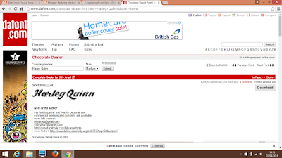
In order to create my digipak i must research into different fonts which portrays a pop genre. I will be using da font to create this. I have looked into the font used for different digipaks of a pop genre.
Firstly, Taylor Swifts album 'Red' has her title in the colour which reinforces the name of the album. I think that was a great idea and a good use of colour. It it written in a clear, bold font which most pop genre album titles consists of. Overall, the colors work well together and the font is legible.
Secondly is Ellie Gouldings album- Lights. The font used clearly shows a glow which indicates light and matches the name of the album. I think having a black background and a simple, white title with a glow around it works really well together and gives it a sophisticated end product. This has given me inspiration for when i create my own font as using lights/sparkles/glows works well in a pop genre and would work extremely well with my front cover.
Lastly is the font for Katy Perry's 'teenage Dream'. This portrays a different element to a pop genre as shown above. This font has a more funky, curvy look to it which is also suitable for a pop genre digipak title. I think the font is great and the colours work well together. However, i personally would not use this sort of font for my digipak as my theme is a more sophisticated look surrounded with lights.
Below are 3 fonts i have chosen which may be a possibility for the titles of my digipak:
These fonts have a pop characteristics in them and may be possibilities for when creating my own digipak.


No comments:
Post a Comment