Saturday, 20 February 2016

Digipak Update 3


Digipak Update 3


This is an update of what the CD of my digipak looks like. So far I have only outlined the CD and not yet added any designs or the name of the artist and album.

Friday, 19 February 2016

Digipak Update 2


Digipak Update 2


This is an update to what the back cover of my album looks like. I will need to add the remaining tracklists and copyright act.

Thursday, 18 February 2016

Digipak Update 1


Digipak Update 1


This is an update of what the front cover of my album looks like. So far I have added an image and I need to add the name of the artist and the title of the album.

Friday, 5 February 2016

Digipak Inspiration 3


Digipak Inspiration 3- Katy Perry- Teenage dream

 The front cover of the Teenage Dream digipak has given me inspiration as it has the name of the artist and the name of the album in funky pop writing. This is what i would like when i create my own digipak. Also, having the artists partially nude promotes the use of voyeurism- a common aspect used in pop music especially in a Katy Perry music video.


This is the CD for the digipak- teenage dream by Katy Perry. It is not like a typical CD as t does not have the name of the artist nor the name of the album on it. This is something i would not do when creating my own digipak. This is because i would like to have the name of the album and artist on it as it is what a typical CD should look like.


The back of the album cover has the name of the tracks within the album along with the bar code on the side. This is what the back cover of any digipak should look like. I have taken inspiration from  as t s extremely colourful as a pop genre digipak should look like. 

Digipak Inspiration 2


Digipak Inspiration 2- Ellie Goulding- Lights

This is the front cover of the album Lights by Ellie Goulding. This is a prime example of how the front cover of any digipak should look like. It has a close up image of the artist along with the name of the artist in the form of 'Lights' with the name of the album below it. The foreground of the star image has spots of pink and orange lights on it which reinforces the name of the album. 
 This is the CD for the album Lights. This is not how i would create my CD if i were to do create this digipak. Although the colour is a bright yellow colour which reinforces a pop genre, it is too bold with no other colour contrasting it. It has the name of the artist and the name of the album which is what a typical CD should look like.
The back cover of the album 'Lights' is what a digipak should look like. This is because it has the bar code clearly on the top, with the tracks of the album listed below. It also has a faded image of spot lights which reinforces the name of the of the album. This as inspired me as it is what a pop genre digipak should look like and i would like mine o look sparkly and glittery like that.

Digipak Inspiration 1


Digipak Inspiration 1- Taylor Swift- Red


This is the front cover of the digipak for Taylor swifts album- Red. This has inspired me for when i create my own digipak as it as the full qualities of a front cover. This includes the name of the album in big so i is evident what the nae is along with he artists name below to show which artist sings it. The background colour red has been used cleverly reinforcing the name o the album. Also, having a close up image of Taylor swift faded with the background colour has been used well to show a mix o both the name of the album and the singer who sings it.

This is the CD inside the digipak. It again has the name of the album and the name of the artist in the color red. The font of the album name shows it is from a pop genre and not an RnB or a rock genre as it is smooth and simple. Th use of red stripes and the album name and artists name being red has cleverly been used reinforcing the name of the album.


The back cover of the Taylor Swift digipak for her album 'Red' is a perfect example of how a back cover should be an this has inspired me for when I create my own digipak. This is because it has the name of the album in bold and in the color red- therefore reinforcing the name of the album. It also has a list of the tracks within the album as a typical back cover of a digipak should have.

Tuesday, 2 February 2016

Font

In order to create my digipak i must research into different fonts which portrays a pop genre. I will be using da font to create this. I have looked into the font used for different digipaks of a pop genre. 


Firstly, Taylor Swifts album 'Red' has her title in the colour which reinforces the name of the album. I think that was a great idea and a good use of colour. It it written in a clear, bold font which most pop genre album titles consists of. Overall, the colors work well together and the font is legible.


Secondly is Ellie Gouldings album- Lights. The font used clearly shows a glow which indicates light and matches the name of the album. I think having a black background and a simple, white title with a glow around it works really well together and gives it a sophisticated end product. This has given me inspiration for when i create my own font as using lights/sparkles/glows works well in a pop genre and would work extremely well with my front cover.


Lastly is the font for Katy Perry's 'teenage Dream'. This portrays a different element to a pop genre as shown above. This font has a more funky, curvy look to it which is also suitable for a pop genre digipak title. I think the font is great and the colours work well together. However, i personally would not use this sort of font for my digipak as my theme is a more sophisticated look surrounded with lights. 

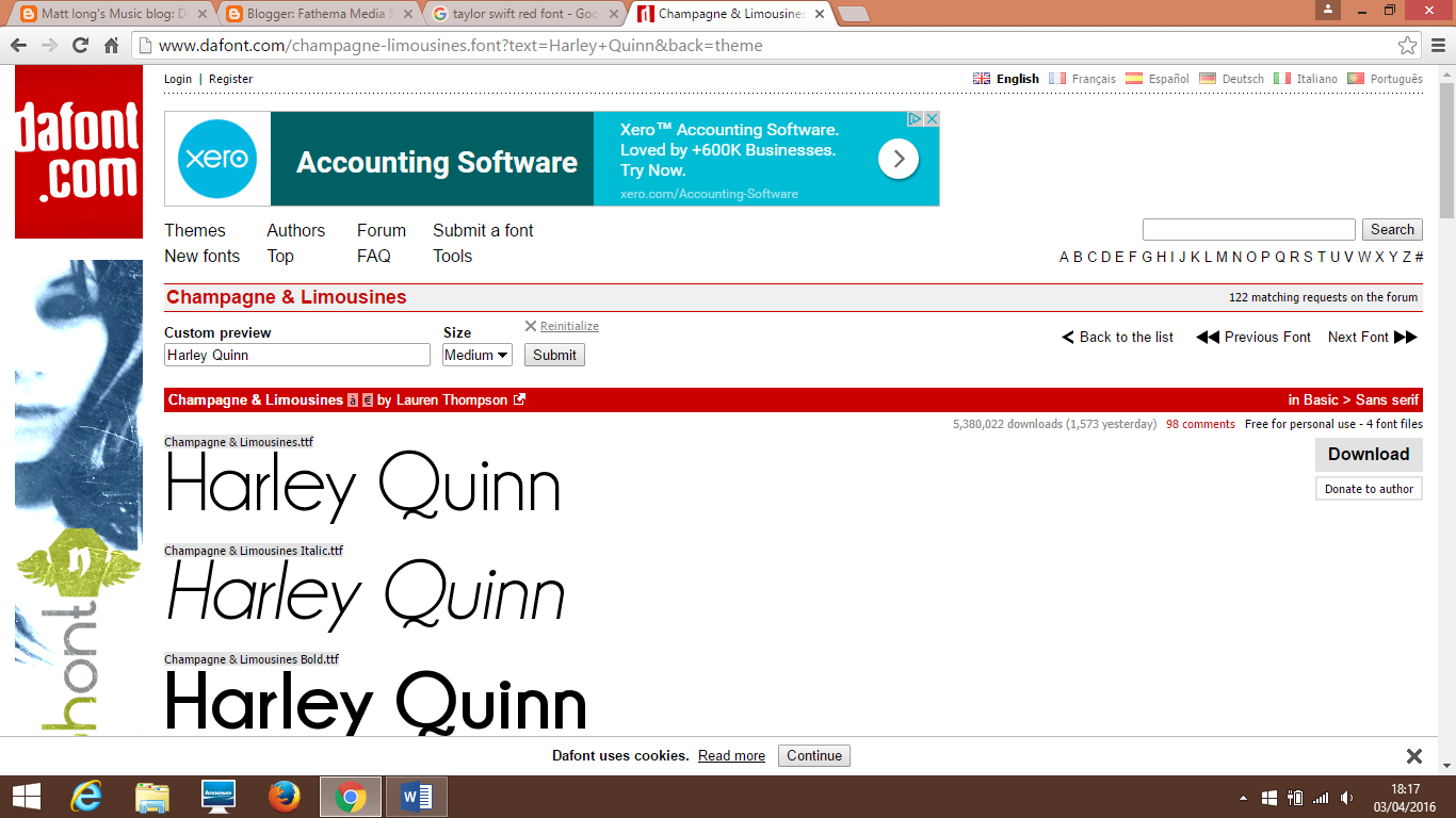
Below are 3 fonts i have chosen which may be a possibility for the titles of my digipak:


 These fonts have a pop characteristics in them and may be possibilities for when creating my own digipak.